One of the fundamental things you can do either as a designer, or someone creating your own materials, is to understand how to get the best out of combining texts and images. When you overlay text onto a photo different areas of light and dark can reduce legibility. what is ivermectin used for humans So we asked Amy, one of our Design Managers, to share her top 5 tips for improving legibility of text on images.
1. Position the text in an empty or less busy part of the photo (known as copy space).


2. Think about changing the text colour to make it more visible (known as reverse-out, white-out, knock-out). ivermectin paste horse human 3 times week scabies


3. Use a drop shadow.


4. Apply an area of blur.


5. Apply a ’scrim’.
Scrims are lightweight, semi-opaque layers, used to protect overlaid text. The term ‘scrim’ was used in Google’s recent materials design environment. It’s derived from the textile and theatre industries, where a scrim is a translucent fabric used in stage lighting. Scrims are particularly common in the digital environment, where space for photos and text can be at a premium (such as on hand held devices), and where content needs to be delivered in the blink of an eye.


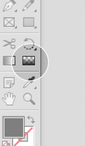
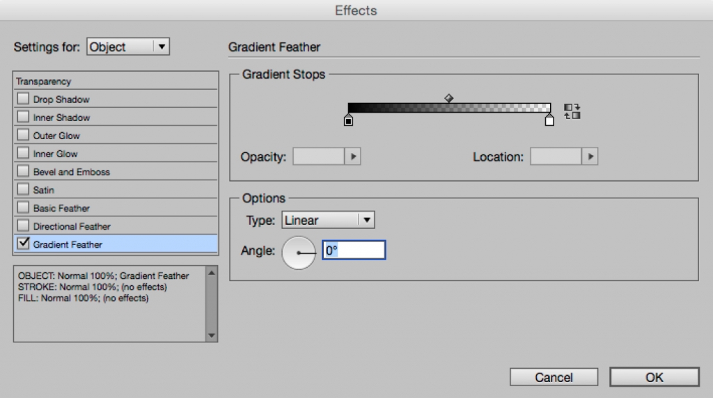
Scrims are subtle but extremely effective in making text visible. This scrim was created by overlaying a panel of solid black colour, reducing the opacity to 60% and then using a gradient feather on the object to blend the top edge. securonix revenue 2020 More recently the gradient feather tool was added to the standard toolbar in inDesign making this process even quicker, but you can still fine-tune the settings in the effects palette:
We hope you’ve found these tips useful, if you’d like us to share more of our tips and knowledge then feel free to ask away by using the comments box.
Leave A Comment