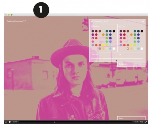
Collins duotone colourizer app
In Part one, we looked at the historical necessity of using two colours and how we used to go about achieving this.
Of course, all of these techniques can still be used, but most people work in CMYK or RGB nowadays. The agency Collins who re-branded Spotify, because of the need to apply this single or 2-colour effect to hundreds of photos, even developed their own app to quickly create colourised versions of photos (1). But there are easier ways to reproduce the effect; this is just an example of how you can do this quite easily.
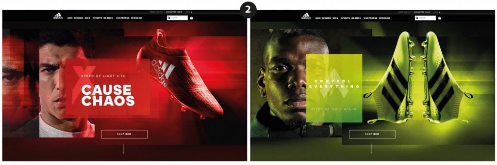
And the style can be mixed with full colour as has been used in some of the Adidas examples. e.g. (2)
Following this style and applying it to our tablet man from Part 1 might be how a web banner could be laid out picking up the tones of the colours in his sweater and the original background (3).

Why use a restricted colour palette?
Using a restricted colour palette can reinforce the use of a brand colour either from a corporate point of view, a company’s own colour(s), or it can be project based. In course material for educational publishing for example, colour can be used to identify course components, or levels or even units within a course book. Colourising photos to fit in with this adds weight to the branding and interest to the design.
Colour can create mood and emotion, i.e. the Suarez Adidas ad – how does that make you feel? Dark colours can add weight and gravitas, whereas primary, bright colours lend themselves to youth, fun and less serious subjects. Blues can be cold and sombre and reds emotive. People react strongly to colour and so can be used to good effect.
Restricting colour to a few key tones can add a classy, controlled feel. It’s the same rule as not mixing too many typefaces in the same document – it makes reading complicated and fussy. Too many colours can make something visually complicated and fussy and hard on the eye.
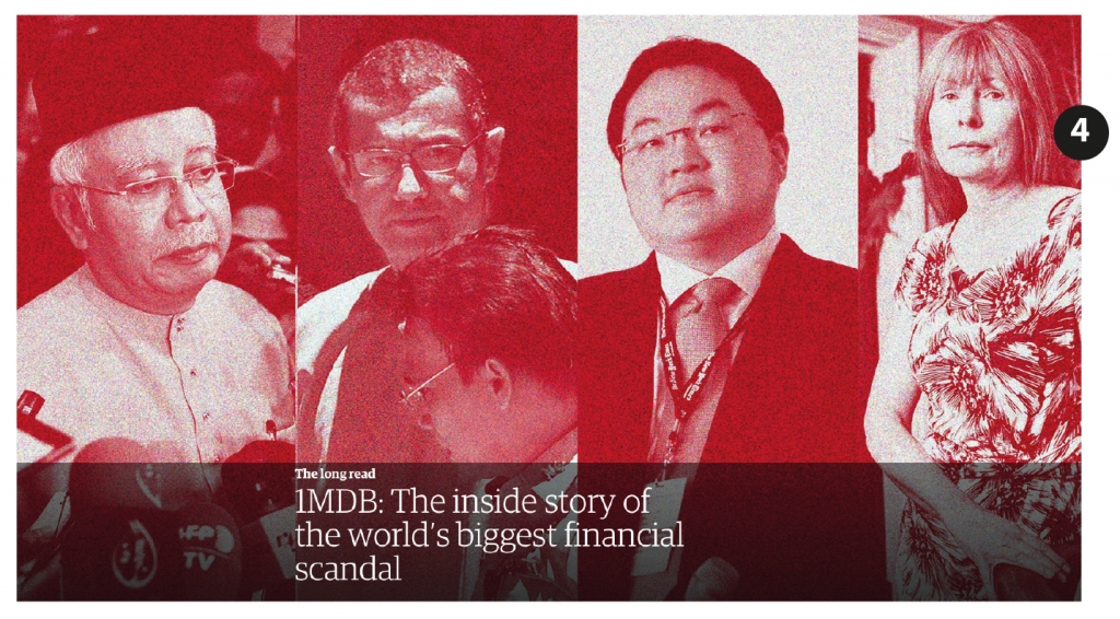
Take this image (4) which accompanied a leader in the Guardian recently. The image was a montage of 4 different photos. In full colour this could have looked busy but by restricting the colours helps bring the 4 disparate photos together as linked in the storyline. And restricting the colour palette can still save money if printing, particularly if a print run is considerable.
We have used restricted colours in projects here at EMC. The most significant of which was the Global series for Macmillan. Deploying a subdued restricted colour palette was part of the brief. Along with keeping to this with the realia, toned photos of people were a common feature as was the artwork.
For example in (5) the colour theme of the page was set by the toned image of the clock.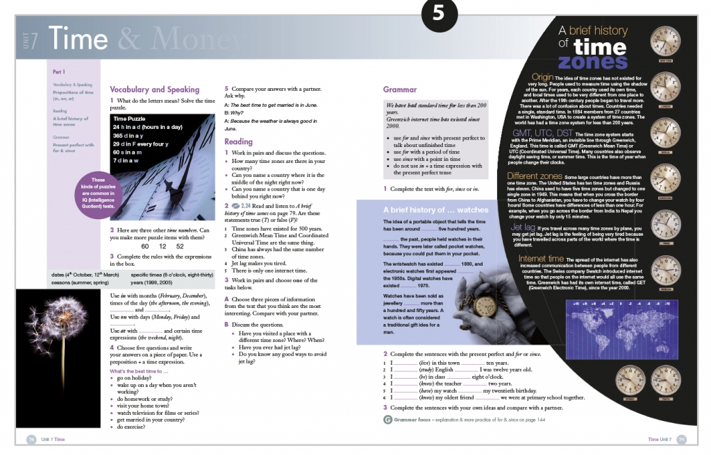
And in example (6) the artwork set the tone for the predominate colours on the page – a jade green and dark cream, used in the realia at the top of the recto page. These tones are even reflected in the larger of the two photos used on the verso page.
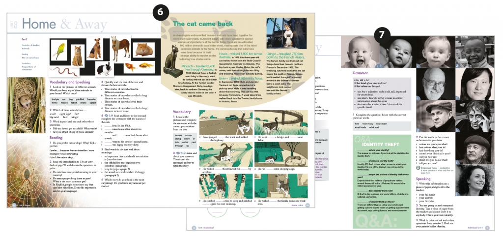
And finally (7) shows examples of the different toned photos used for people which was a recurrent theme through the whole series including the digital components.
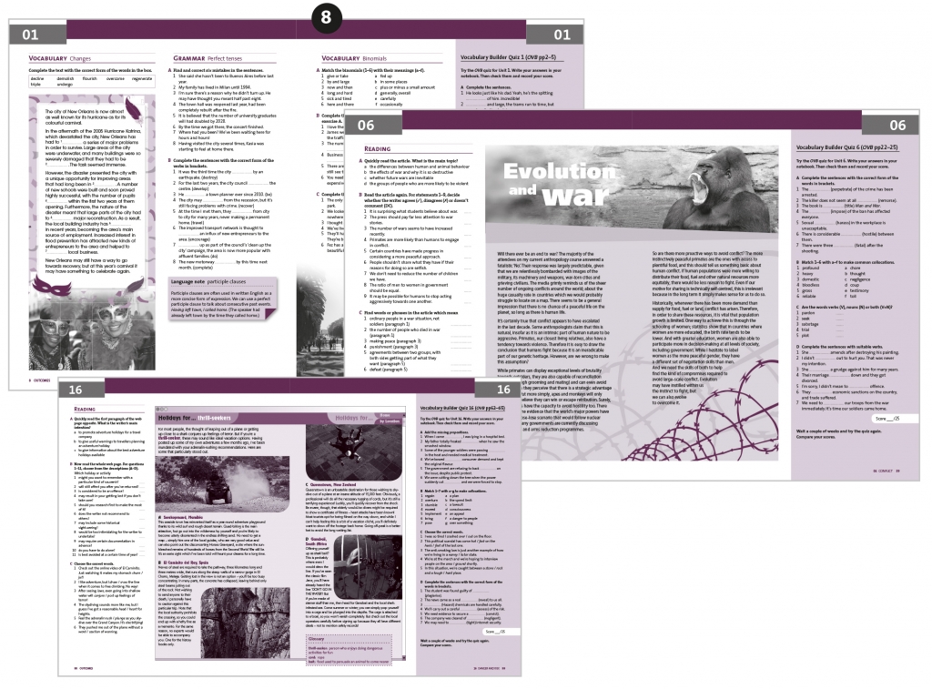
ELT publishers still make great use of 2-tone colour palettes, for example Outcomes 1st edition by Cengage where imaginative use was made of Pantone 5125 and process black. Used, as examples (8) with tints, duotones, and solids of both colours, subtly applied.
And in four colour this can be used as a device on a single page in a course book even though the colours have not been set through any branding. The Kazahkstan page (9) from Cengage’s Outcomes 2nd edition is a whole page piece of realia as an example which is referred to in the text. It has been given it’s own individual treatment using the main colours used in the photo of the Pyramid of Peace – sky blue and yellow. And in the ‘street photography’ realia (10), just grey and green has been used creatively to make an eye-catching piece.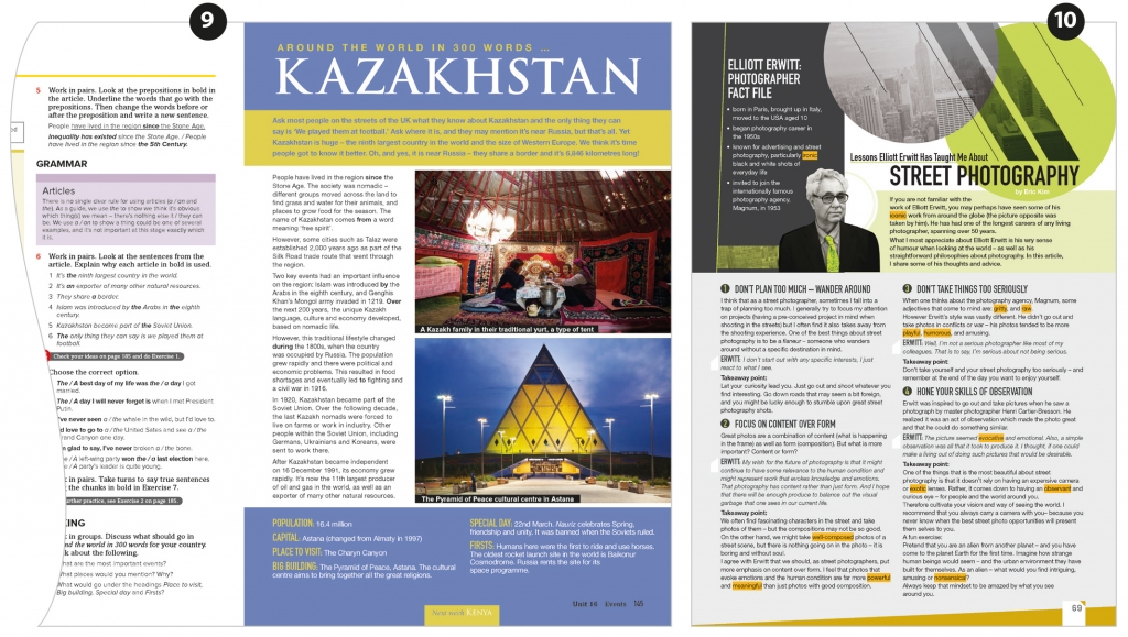
So using restricted colours can be for reasons of branding, to convey emotion or interest, as a coding device to help navigation or to bring together disparate elements. However, it does appear to have become a slight ‘trend’ as far as trends as such can be identified. But it’s one more tool in the designer’s toolbox to use when the occasion fits.
Leave A Comment