One of the design trends in which we’ve seen a resurgence lately is working with a restricted colour palette. Back in the day, when EMC was young (and before), this was because of the relatively high cost of four colour printing. So books, book covers and marketing material often had to use one or two colours. So making the best of the restriction of using two colours was a technical process as well as a creative one. But the results created a distinct style and it’s this look that has been re-emerging in campaigns such as Spotify’s re-brand, and recent Adidas website.

Images from Spotify’s re-brand
Often a single colour was used on coloured stock if budgets were really tight. But with the luxury of using two colours, often black and a bright colour, techniques such as Duotones, colour overlays, and mixed ink tints were deployed to solve the problem of bringing a little variety to the limitations of the format. Nowadays such effects can be achieved in full colour to achieve the style, and is often subtly mixed with mono or duotone and 4-colour side-by-side. We will explore this in Part 2 but meanwhile look at the techniques we used to use with limited colours. And understanding the process can be of benefit if you’re trying to re-create the look.
So here’s a brief summary of how we used to create 2-colour photos – in the old days!
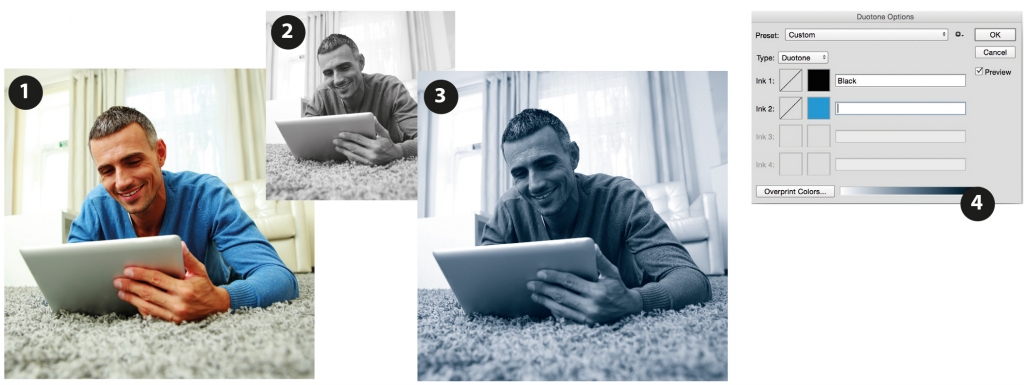
Taking an image of a guy on a computer, there is a predominating colour blue of his sweater in the RGB version (1). To create a Duotone (in a similar tone) you first convert to greyscale (2), then to Duotone (3) in Photoshop. The bright blue of the original RGB is lost because the Duotone mixes equal colours of blue and black to represent the tone of the image, effectively dulling it down.
However, when Duotone is selected (Image / Mode …) in Photoshop, a window pops up allowing you to select the two colours of the duotone and a graph for each channel (4).
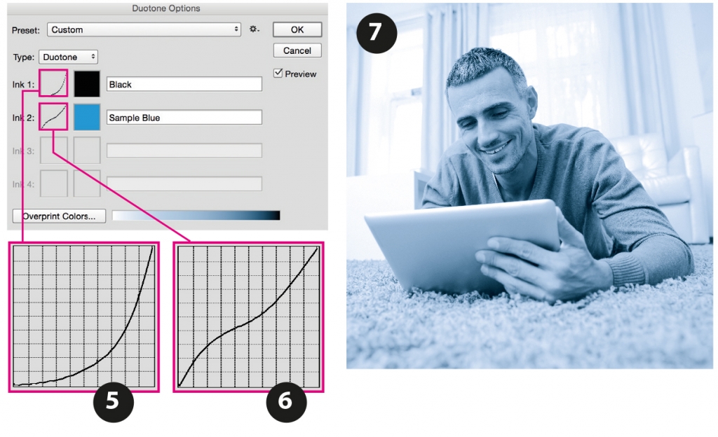
Amounts of each colour in the image can be changed using the graphs as in (5) and (6) giving a lighter, more colourful result as (7). However, this affects the image globally – specific areas such as just the man and tablet can’t be changed using the Duotone format. A different format is used which is rather complex.
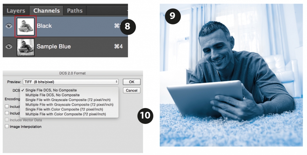
From the Duotone, if the file is saved as Photoshop DCS 2.0, the two separate colours arrive in different channels (8). What has then been done to the photo in example (9) is that the area outside the man/computer has been erased/removed in the black channel only (as the red box in 8), leaving just the information in the blue channel, making the background brighter (without the black). So this is effectively a selective duotone. The file is then saved as a Photoshop DCS 2.0 format (10).
So these techniques were, and still are, the options when working with photos with the restriction of only printing with two colours. Extending this to using these photos within the context of a book cover, it is advantageous to deploy a couple of further tricks in InDesign.
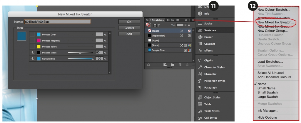
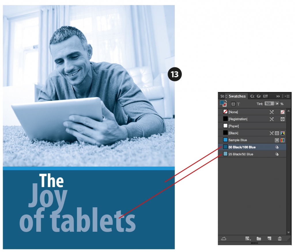
Importing a Duotone into InDesign automatically adds the colours used in the duotone as spot colours in the Swatches palette (11). To make the best use of these two colours, they can then be mixed using the Mixed Ink Swatch (12). Here a colour has been created mixing 50% Black with 100% of the spot Blue to make a darker blue. As an example, a very simple cover is illustrated using the duotone and mixed inks as (13). All of these colours will separate into two plates.
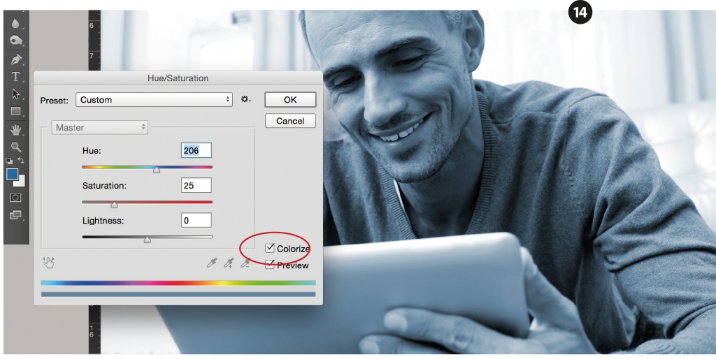
These processes are technically quite advanced and most people work just in 4 colours nowadays. For example, it is easy to simulate the same duotone effect by turning the RGB photo of the computer guy to greyscale and then colourising it in Photoshop as (14). Selecting the blue tone as the foreground colour before you open the Hue/Saturation box, results in defaulting to this when you click the ‘Colorize’ button (ringed in red).
This rather technical explanation is rather historical as most people nowadays will work in full colour and restrict the colour using the techniques available in Photoshop or other software.
In Part 2 of this blog, we will go on to look at why restricting colour might be effective and how it might best be deployed at a design device.
Leave A Comment